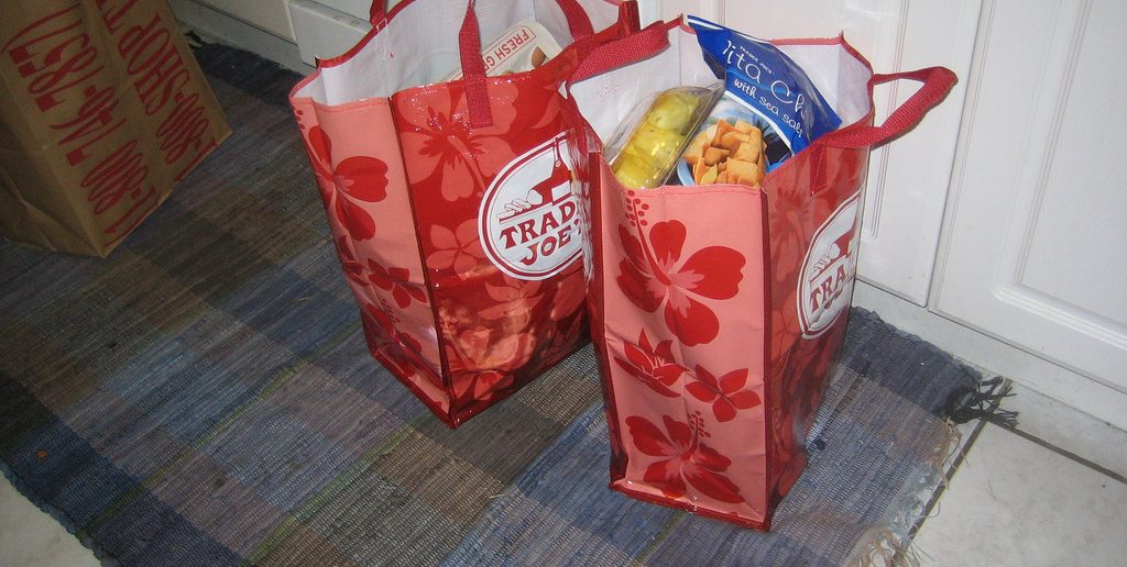
Carrier bags do more than just help customers to carry stuff from shops to their homes. These are tiny mobile billboards help promote the store by getting more eyes on the brand. When designed with enough imagination, these humble bags can get people talking about your store and thus increase more footfall. However, the streets are saturated with custom carrier bags with logos of different stores and businesses. That means a custom grocery bag that doesn’t impress would most likely go unnoticed. This is why a designer’s job is so crucial. It’s up to him or her to utilize the limited branding real estate and create something that captures the imagination of people within seconds. Remember, people only spare a few seconds to glance at a stranger’s bag on the streets. You know it’s a job well done when customers spend 3 to 4 seconds looking at the bag. That’s all the time most grocery carrier bags would ever get. Within that time the design has to impress and encourage a positive action, whether it’s visiting a store or going to a company website. Following are 4 fundamental tips to get you on your way to creating awesome carrier bag designs for your business or clients.
Keep the Text Count Low: The basics of creating any artwork is to create a design that doesn’t look cluttered. Designs that are cramped with text looks unattractive and thus fails to impress. Think about it, do you really need to insert your store address, phone number, and other contact details on a grocery bag? No one’s going to read that. Stop treating your store grocery bag as a business card by mercilessly trimming down the text content. You want customers to notice your brand by creating a visual impression. That’s why it’s best to include the company logo and probably a smart or funny tagline.
Play with the Handle: Have you seen bags that incorporate their handles into their designs. These custom carrier bags look so impressive that they immediately draw attention to them. Some shoe store brands make the rope handle look like laces of the sneaker that’s printed on the bag. Design in a way that the handle, be it die-cut or rope, looks like an extension of the printed design.
Use No More Than Three Colors: If you are a seasoned designer then you already know this. Using more than three colors often makes the overall design look confusing and unprofessional. This is why it’s best to keep the color count within three (including the color of the handle). If you are using the triadic color scheme principle, then use a primary color as the background of the bag, a secondary color for the texts and logos, and a tertiary color for other elements.
Pick an Unusual Carrier Bag Material: One of the best ways to create a convincing design is by picking a great medium. For example, cotton or jute bags have a natural textured look, which often goes really well with colored designs. Therefore, if you have the budget you should definitely consider switching from plastic to materials such as jute, cotton, or even paper.


